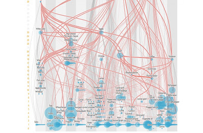
I know, this graphic looks boring, complex and frankly overwhelming… but I promise you, it’s so cool! Read on…
Ever wonder why certain foods just seem to belong together? For example, fish tastes great with lemon; beef goes well with potatoes. It turns out that these foods share flavor related chemical compounds, and a new interactive map from Scientific American can show you which foods and flavors may mix best together when you are experimenting in the kitchen!
On this map, you’ll find around 200 commonly used foods, spices, drinks and other ingredients, with bigger dots on the map representing ingredients with greater popularity based on a recipe database. The higher the food is on a page, the greater number of foods that are connected to it by having flavor related chemicals in common. Click on one of your favorite ingredients on the map, and the program will show you not only which other foods are connected to it, but also how strong that connection is (see the program’s excellent explanatory guide that pops up when you first open the page).
Have fun! My motivation in sharing this, of course, is to encourage more cooking from the home – there are no ‘hidden ingredients’ (such as loads of extra oil) in home cooked food that can sabotage a healthy lifestyle!
Thanks to my friend Priti for the heads’ up on this awesome program!


